
Countless business owners spend thousands of dollars setting up a beautiful website, then watch it disappear into the depths of search results. The site looks polished. The branding feels right. But the traffic never comes, and the phone doesn’t ring.
What most people do not realize is that Google does not rank websites the way a human visitor judges them. A visitor sees colours, layouts, and great photography. Google sees code, structure, load times, and user signals—and when those signals are broken, even the most stunning website becomes invisible.
The gap between a great-looking website and a high ranking one is almost always a collection of small, avoidable errors. None of them feel catastrophic on their own. But together they add up to a site that quietly underperforms month after month.
Let’s discuss the most troublesome web design mistakes that are slowly killing your Google rankings.
These are not obscure technical problems reserved for developers. They are design decisions—made every day—that directly affect how Google reads and ranks your site.
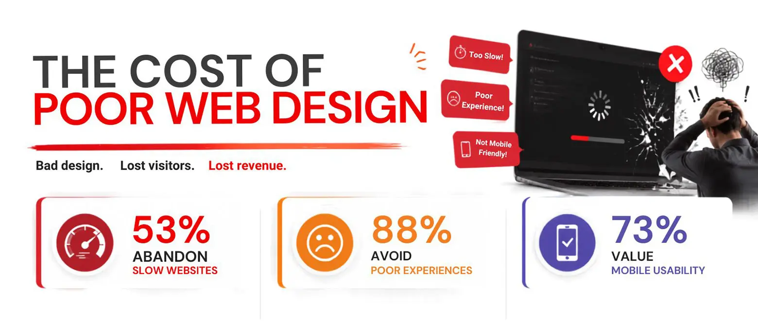
One of the most common web design mistakes is treating mobile as an afterthought. That’s because Google switched to mobile-first indexing several years ago, which means it crawls and ranks the mobile version of your website—not the desktop version.
If your site was built with desktop screens in mind and simply “scales down” for phones, you are likely losing ranking ground. Buttons that are too small to tap, text that forces users to zoom in, and images that spill off-screen all create poor mobile experiences.
High bounce rates from frustrated mobile visitors send a clear negative signal to Google.
Every second your website takes to load, you lose visitors and rankings. Google has made page speed a genuine and confirmed ranking factor, and research consistently shows that most users abandon a site that takes more than three seconds to load.
Slow sites are almost always the result of design choices, i.e., oversized images that were never compressed, video files embedded directly instead of hosted externally, or too many decorative scripts running on every page.
Speed affects not just rankings but conversions. A fast site feels trustworthy, while a slow one feels broken, even when the content is excellent and the design is clean.
Headings are not just visual design elements. They are the structural roadmap Google uses to identify and understand what your page is about.
When designers use heading tags (H1, H2, H3) purely for aesthetic sizing rather than logical hierarchy, the page loses its semantic clarity. A page with multiple H1 tags or body text styled to look like headings without using proper tags, confuses both users and search engines. A service page with no H2 structure cannot signal to Google which subtopics it covers. This is a quiet but significant web design mistake that undermines well-written content.
Images add life to a page, but Google cannot see them the way a human can. It reads the alt text—the short written description attached to each image—to understand what the image shows and how it relates to the page content. When designers upload images without alt text, or when the alt text is left as a generic filename like “IMG_00432.jpg,” those images contribute nothing to your rankings.
Missing alt text also creates accessibility problems for visually impaired users relying on screen readers. Proper image descriptions are a basic but frequently skipped part of any SEO-friendly web design process.
Internal links—i.e., the links that connect one page on your site to another—do two important things: they help visitors find related content and they tell Google which pages are most important.
Many website builds focus entirely on external appearance and forget to build a logical internal link architecture. Pages that sit in isolation, with no links pointing to them or from them, are much harder for Google to find and rank.
For instance, a blog post about local marketing that never links to your services page is a missed opportunity on both fronts. This is a design and strategy problem, not just a content one.
A common web design mistake is building service pages that look beautiful but say very little. A page with a hero image, a three-line description, and a contact form might look clean and modern, but it gives Google almost no information to work with.
Website design and SEO work best when pages contain enough structured, relevant content to signal topical depth. Google rewards pages that genuinely answer questions and explain services in detail.
Content-thin may feel minimal and elegant to designers, but they consistently underperform in search results compared to pages that take the time to actually explain what a business does and how.
Readability is a ranking signal, though an indirect one. When users land on a page and find light grey text on a white background, or a decorative script font used for body copy, they leave quickly. High bounce rates and short session durations tell Google that visitors did not find what they were looking for, and rankings drop accordingly.
The best web design SEO practices consistently include contrast ratios, readable font sizes (16px minimum for body text), and sufficient line spacing. Poor readability affects trust. A page that is hard to read feels unprofessional, and visitors make that judgement in under two seconds.
These issues sit slightly deeper in the build, but they are just as damaging to your Google rankings as anything visible on the surface.
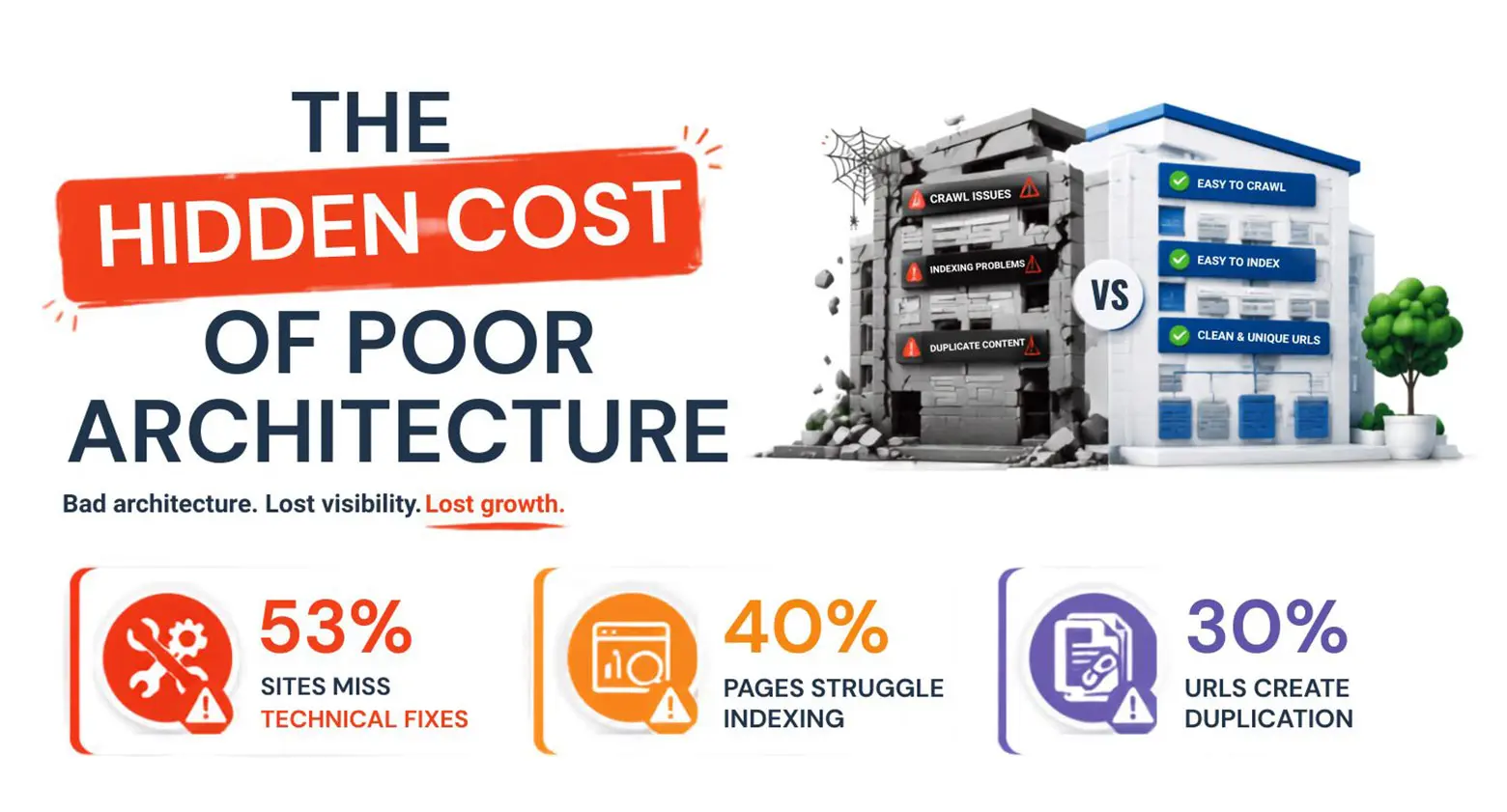
A sitemap is the document that tells Google exactly which pages exist on your website and how they relate to each other. Many websites are built and launched without one, or with a sitemap that was generated but never submitted to Google Search Console.
Without a properly configured sitemap, Google must find your pages by crawling links—a slower and less reliable process. Newly added pages may take weeks to be indexed rather than days.
This is a foundational web design mistake that is easy to fix but often overlooked in the rush to launch a new site.
When your website serves the same content on multiple URLs—for example, both “yoursite.com/services” and “www.yoursite.com/services”—Google may split the ranking credit between them rather than consolidating it on one strong page.
This happens more often than most business owners expect, and it is almost always a result of how the site was built rather than how the content was written. Canonical tags and proper redirects solve the problem, but they need to be part of the design and development process from the beginning. Duplicate content dilutes your authority and is one of the more technical but consequential web design mistakes to address.
Modern web design often relies heavily on JavaScript to create dynamic and interactive experiences. Animations that trigger on scroll, content that loads after the page opens, and menus that build themselves on demand can all look impressive. Too bad they create problems for search engine crawlers that may not render JavaScript the same way a browser does.
If your navigation, key service descriptions, or calls to action are buried inside JavaScript that Google struggles to read, those elements may as well be invisible to search. This is a growing tension between design ambition and SEO, and it requires careful technical decisions during the build.
Schema markup is structured data added to your website’s code that helps Google understand what your content represents. A local business, a product, an article, a review—schema tells Google what it is looking at in clear, standardized language.
Most websites are built without any schema at all, which means they rely entirely on Google interpreting the content correctly on its own.
Adding schema will not guarantee a top ranking, but it does improve how your pages appear in search results and increases the likelihood of scoring rich snippets which increases your click-through rate. Skipping it entirely is a missed opportunity that compounds over time.
Google watches how visitors behave on your site. These four mistakes send the wrong signals—and rankings fall as a result.
Nothing sends a visitor fleeing faster than landing on a page and being ambushed by a video that starts playing on its own. It is intrusive, it slows the page down, and it immediately erodes trust.
Most visitors will close the tab before giving the content a fair read. Google tracks this behaviour—specifically, the rate at which users bounce back to search results immediately after landing on your page—and uses it as a ranking signal.
Auto-play media might feel dynamic and modern to a designer, but it consistently damages the user experience metrics that search engines measure most closely.
A navigation menu with fifteen items, dropdown layers three levels deep, and no clear hierarchy does not help visitors—it overwhelms them. When users cannot find what they are looking for quickly, they leave. When they leave in large numbers and return to Google, it signals that your site did not satisfy the search intent.
Clean, logical navigation is both a usability principle and an SEO one. A simpler navigation structure makes it easier for Google to grasp the hierarchy of your site. Cluttered menus are a web design mistake that looks like an aesthetic preference but carries real ranking consequences.
A page without a proper next step trains visitors to leave without doing anything impactful. From Google’s perspective, a session where someone lands, reads briefly, and then exits without visiting another page or converting is a low-quality visit. Over time, patterns like these weaken your site’s authority signals.
Every service page, landing page, and blog post should guide the reader toward a logical next action, whether that is reading a related article, requesting a quote or signing up for a newsletter. This is where design and strategy meet. A well-placed written call to action keeps visitors engaged and signals value to search engines.
A broken link—one that leads to a page that no longer exists—creates a dead end. Visitors hit an error page and leave. Crawlers follow the link and find nothing. Over time, a site with multiple broken links accumulates a reputation for poor maintenance, and that affects both user trust and crawl efficiency.
Broken links are often the result of redesigns where old page URLs changed without proper redirects in place. Running a regular link audit is part of responsible site management, and addressing broken links promptly is one of the most straightforward web design SEO best practices available to any site owner.
A well-designed website should do two things well: serve its visitors and earn its rankings. When web design mistakes go unaddressed, they quietly erode both. Most of these problems are fixable but only once you know they are there. Take the time to audit your site with the same critical eye you brought to its visual design. The technical and structural health of your website is not separate from its appearance. It is the foundation upon which everything else stands.
The most common issues include slow page load speeds, poor mobile responsiveness, missing alt text on images, thin content on service pages, broken internal links, and unstructured heading hierarchies. Most of these are preventable during the design and build phase with proper planning and a clear SEO strategy in place.
Google uses mobile-first indexing, meaning it evaluates the mobile version of your website to decide the rankings. If your mobile experience is poor—with cramped text, small buttons, or slow load times—your rankings will still suffer regardless of how strong your desktop version appears to visitors and reviewers.
Absolutely. Visual design and SEO performance are separate disciplines. A site can look polished and professional while suffering from slow speeds, missing metadata, poor heading structure or JavaScript issues that block crawlers. Good design and strong SEO require deliberate collaboration between the designer, developer and content strategist.
A full audit every six months is a reasonable starting point for most small to mid-sized businesses. However, after any significant redesign, migration, or content restructuring, an immediate audit is strongly recommended. Tools such as Google Search Console, Screaming Frog, and PageSpeed Insights make the process manageable without requiring a technical background.
Yes, consistently. Google confirmed page experience signals which includes load speed as one of the ranking factors. Beyond rankings, speed also affects conversions. Even a one-second improvement in load time can meaningfully increase the percentage of visitors who stay, read ,and take action on your pages.
Schema markup is the code added to your website that helps Google understand your content more precisely, whether it is a local business, a service, a review, or an article. You do not technically need it to rank, but it improves how your site appears in search results and can generate rich snippets that increase click-through rates significantly.