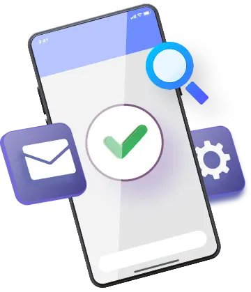
Attract More Users with a Highly Optimized Mobile Website

There are more mobile users and people dependent features like voice search. This means it’s necessary for businesses to have a website optimized for mobile devices to create a seamless experience. At G Web Pro, we create mobile websites for businesses that need personalized mobile functionality and receive a high volume of user interaction from mobile devices.

Our mobile-first approach begins with analyzing the business and its targeted audience. Our speciality lies in creating an adaptive layout that changes itself depending on the screen resolution of different mobile devices. We ensure that the interfaces of your mobile website have proper shapes and font sizes so that the user experience has no unnecessary zooming and scrolling.

Easy to NavigateEasy to Navigate

We make sure that your website’s content is easy to read and navigate. We create an easy path to find all the sections of your website along with your contact details. Keeping the necessity of multiple languages for some specific types of businesses in mind, we also build multi-language websites that are compatible with all popular browsers.

Optimized MultimediaOptimized Multimedia

Since all types of mobile devices don’t support all media formats, we keep your content simple and easily clickable. If you need videos and images on your mobile website, we make sure that they don’t get blocked by certain mobile operating systems. We optimize your media files in such a way that they look beautiful on all mobile screen sizes.

Location RelevanceLocation Relevance

Smartphones are able to transmit user’s location, allowing the major search engines deliver a location-specific data. It helps us optimize your site locally so that your business becomes visible to the targeted audience of a specific area. To make your website more authentic when searched locally, we offer Google Maps integration that lets the users track your location via GPS.

appearance Appearance  

We always keep the desktop version of your site connected to the mobile version while designing the mobile website so that the users can correlate between them. Considering the popularity of mobile apps, we try to add an app-like experience to your site to enhance the user-friendliness.

Latest TechnologyLatest Technology

We follow the latest trends and are well aware of the technology updates. Wearable technology is gaining popularity these days as people prefer wearing smart devices. Thus, we design mobile websites in a way that they look nice even on the smaller screens like Apple watch and Android compatible device.

Featured
Web Design
Projects

Clear optical is a Toronto based local optometrist renowned for offering end to end vision care needs.

view project

Featured
Web Design
Projects

Page One is a leading brand in the lighting industry of Toronto. The company is known for having distributer partners across the globe.

view project

Why Choose Us?

  • Easy to Manage

    The platforms used by us for mobile website design are scalable and easy to operate. Our CMS systems ae browser-based to let you easily log in and make necessary changes to your website. With us, you can also get in-person and written documentation on how to manage your site.

  • Creative Customization

    We have mastered in CMS and mobile app development and thus, are able to make customizations for the intensified outgrowth of a business. We ensure that your website has an attractive layout while keeping your brand value intact. Our professional team of creative minds combines your vision and our ideas into reality to yield the best result.

  • Continuous Development

    There’s nothing static in the mobile world where new features get launched every single day. Keeping your online store always updated is the most important job here. Therefore, we always suggest and make necessary changes to keep the ball rolling.